How to Create a Visual Identity for Your Band
Your band's visual identity is the first thing potential fans, venues, and industry professionals encounter. Before they hear a single note, they see your logo, your photos, your album art, and your social media presence. A strong, cohesive visual brand communicates professionalism, builds recognition, and helps you stand out in a crowded musical landscape. A weak or inconsistent visual identity signals amateurism and makes you forgettable.
This guide covers how to develop a visual identity for your band that is authentic, professional, and effective across every platform and medium.
Why Visual Identity Matters for Bands
In an era of infinite musical choice, visual identity is a critical differentiator. Audiences discover music through visual channels—social media feeds, streaming platform thumbnails, music videos, and album art. A striking visual presence makes people stop scrolling, click play, and remember you.
Visual identity also builds trust. When a band's photos, logo, website, and social media all share a consistent look and feel, it signals that the band is serious, organized, and professional. Venues and promoters notice this. A band with a polished visual identity looks like a band that will show up prepared and deliver a professional performance. A band with mismatched, low-quality visuals looks like a band that might not.
Finally, visual identity creates emotional connection. The colors, typography, and imagery associated with your band become part of how fans experience your music. Think of iconic band aesthetics—the dark, gothic drama of certain metal bands, the bright, playful energy of certain pop acts, the gritty, urban feel of certain hip-hop artists. These visual choices are not decorations; they are part of the artistic expression.
Defining Your Band's Visual Personality
Before you start designing anything, you need to define your band's visual personality. This should grow organically from your music, your lyrics, and the story you tell as a band.
Start with your sound. Your visual identity should reflect your music. A band playing dark, atmospheric post-rock should not have a bright, bubbly visual identity. A high-energy party band should not look somber and minimalist. The visual and musical should feel like expressions of the same artistic vision.
Consider your story. What is the narrative behind your band? Are you rooted in a particular place or culture? Do you draw from specific musical traditions? Do your lyrics explore particular themes? Your visual identity can reflect these elements through imagery, color, and typography that connects to your story.
Think about your audience. Who are your fans, and what visual language resonates with them? A band targeting Gen Z audiences will have different visual sensibilities than one targeting older listeners. This does not mean chasing trends—it means being aware of the visual context your audience inhabits.
Identify adjectives that describe your band. Are you dark and moody? Bright and energetic? Vintage and nostalgic? Modern and minimal? Raw and authentic? Polished and professional? Write down five to seven adjectives that capture your band's essence. These become the guideposts for all visual decisions.
Look at bands you admire. What visual elements do they use? What makes their identity effective? Do not copy, but analyze. Understanding why certain visual identities work helps you develop your own.
The Core Elements of Visual Identity
A complete visual identity includes several core elements that work together to create a cohesive look.
Logo
Your logo is the cornerstone of your visual identity. It appears on everything—social media profiles, merchandise, album art, posters, and your website. A strong logo is simple, distinctive, and scalable (it looks good whether it is a tiny social media avatar or a giant backdrop on stage).
Your logo does not need to be complicated. Many iconic band logos are simple wordmarks—distinctive typography treatment of the band name. Others incorporate symbols or imagery. What matters is that it is recognizable, reproducible, and aligned with your visual personality.
If you are not a designer, invest in one. A professionally designed logo costs money but pays dividends for years. It is the single most-used visual element of your brand, and a poorly designed one undermines everything else.
Color Palette
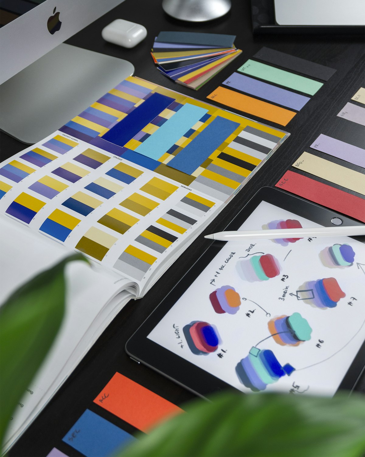
Choose a primary palette of two to four colors that represent your band. These colors should appear consistently across your photos, social media, website, merchandise, and album art. Consistent color use is one of the strongest ways to build visual recognition.
Your color choices should reflect your visual personality. Dark, moody bands might use deep blues, blacks, and accent colors like crimson or gold. Bright, energetic bands might use vibrant, saturated colors. Vintage-inspired bands might use muted, retro tones. Choose colors that feel right for your music and stick with them.
Typography
The fonts associated with your band are a subtle but powerful part of your visual identity. Choose one or two typefaces—one for headings and one for body text—and use them consistently across all materials. Your typography should align with your visual personality: bold and modern, elegant and classic, raw and handwritten, or whatever fits your band.
Limit your typeface choices. Using a different font for every project creates visual chaos. Consistency in typography, like consistency in color, builds recognition and professionalism.
Photography Style
Your photos are perhaps the most impactful element of your visual identity. They appear in your press kit, on your website, across social media, and in press coverage. A consistent photographic style—similar lighting, composition, color treatment, and mood—makes your visual identity instantly recognizable.
Define your photography style in words so that every photoshoot produces images that fit. Are your photos dark and dramatic? Bright and candid? Vintage and film-like? Urban and gritty? Natural and outdoor? Share this direction with your photographer so they understand the aesthetic you are going for.
Invest in professional photography at least once a year. Your photos are worth the investment—they are used everywhere and they define how people perceive your band. Smartphone photos, even good ones, do not convey the same level of professionalism.
Graphic Elements and Textures
Beyond logo, color, typography, and photos, consider secondary graphic elements that add texture and personality to your visual identity. This might include patterns, textures, illustrations, or graphic motifs that appear across your materials. These should be used sparingly and consistently—they are accents, not the main event.
For example, a band with a vintage aesthetic might use distressed textures and retro graphic elements. A band with a modern, electronic sound might use geometric patterns and clean lines. These elements add depth and personality when used thoughtfully.
Applying Your Identity Across Platforms
A visual identity only works if it is applied consistently. Every place your band appears visually should reflect the same identity.
Social Media
Your social media profiles are where most people encounter your band visually. Use your logo as your profile picture across all platforms for consistency. Use cover photos and banners that reflect your visual identity. Ensure that the photos and graphics you post align with your color palette, typography, and photography style.
This does not mean every post looks identical. It means there is a visual coherence—a recognizable aesthetic that ties everything together. When someone scrolls through your feed, they should see a consistent visual world, not a random assortment of images.
Website
Your website is your visual headquarters. It should fully embody your visual identity—your logo, colors, typography, photography, and graphic elements all working together in a clean, professional design. Your website is often the first place industry professionals and serious fans go to learn about you. Make it count.
Album Art and Release Visuals
Your album and single artwork should be consistent with your overall visual identity while also being distinctive enough to stand on its own. Each release can have its own visual personality, but it should feel like part of the same family. A fan should be able to look at your album art and immediately know it is your band.
Merchandise
Merch is where your visual identity becomes tangible. T-shirts, posters, stickers, and other merch are walking advertisements for your band. Design merch that people actually want to wear and display—not just a logo slapped on a cheap shirt. Thoughtful, attractive merch designs become a revenue stream and a marketing tool simultaneously.
Posters and Promotional Materials
Show posters, flyers, and digital promotional graphics should all reflect your visual identity. Consistent design across promotional materials builds recognition—when people see your poster style, they know it is your show before they read the details.
Maintaining Consistency
The biggest challenge with visual identity is not creating it—it is maintaining it consistently over time. Here are practical strategies for consistency.
Create a brand guide. Document your visual identity in a simple guide that includes your logo files, color palette (with hex codes), typography choices, photography style, and any other visual standards. Share this with anyone creating visual materials for the band—photographers, designers, poster makers, and social media managers.
Use templates. Create templates for social media posts, show posters, and other recurring visual needs. Templates ensure consistency while saving time. Even a simple Canva template that uses your colors, fonts, and logo keeps your output coherent.
Curate ruthlessly. Not every photo or design belongs in your public-facing materials. Be selective about what you post. A few strong, on-brand visuals are far more effective than a flood of random content.
Review periodically. Visual identities can drift over time as different people create materials and trends influence decisions. Review your visual presence every few months to ensure it remains consistent and aligned with your intended identity.
Evolving Your Identity
Consistency does not mean stasis. Your visual identity should evolve as your band grows and your music changes. Major releases, lineup changes, or shifts in musical direction may warrant visual updates. The key is to evolve deliberately, not randomly.
When evolving your identity, maintain a thread of continuity. A complete visual overhaul can alienate existing fans and lose the recognition you have built. Instead, evolve elements while keeping the core recognizable. Think of how major artists evolve their visual identity across album cycles—each era has its own look, but there is a through-line that connects them.
Budget and Resources
Developing a visual identity does not require a massive budget, but it does require investment in the right places.
Prioritize professional photography and logo design. These are the elements that appear most frequently and have the biggest impact on perception. If you can only invest in two things, invest in these.
Use affordable design tools for ongoing needs. Canva, Adobe Express, and similar tools make it easy to create on-brand social media graphics, posters, and simple merch designs without a designer. Use your brand guide to ensure consistency.
Barter and collaborate. If budget is tight, consider collaborating with emerging photographers or designers who want to build their portfolios. Offer them credit, exposure, and a positive working relationship in exchange for their services.
Invest in quality over quantity. One professional photoshoot that produces a set of strong, versatile images is worth more than dozens of smartphone shots. One well-designed logo serves you for years. Spend your budget on quality foundational elements, then use affordable tools to extend them across all your needs.
The Bottom Line
Your band's visual identity is an integral part of your art and your career. It is how you are perceived, remembered, and recognized. A strong, consistent visual identity builds trust, creates emotional connection, and helps you stand out in a crowded field.
Take the time to define your visual personality. Invest in the core elements—logo, photography, color, typography. Apply them consistently across every platform and medium. And as your band grows, let your visual identity grow with it, always maintaining the thread of authenticity that connects your visuals to your music.
And to keep your visual assets organized alongside your gig schedules, setlists, and band information, tools like SetSync provide a centralized hub for everything your band needs to operate—so your visual identity and your operational logistics are both handled with the same level of care.